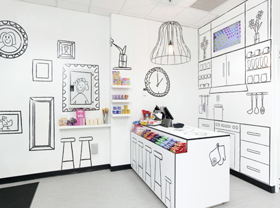
One major psychological influence that all retailers make use of is colour.
Colour can be everything to a successful store if the palettes work well across the whole shop and complement other elements, such as displays and lighting.
The point, especially for retail designers, isn’t about creating the most beautiful shop, but one that uses colour effectively in its overall design.
Colour is central to coherence because we react instinctively to it.
Our brains are hardwired to respond to colour and, for modern retailers, the trick to using colour is to understand both its physiological and psychological influences.
The colour spectrum is organically linked to human responses.
The cool end – violets, blues, and greens – has a quieting, tranquil influence; the warm end – yellows, oranges, reds – tends to stimulate and excite.
The selection of a colour palette in a store should be made to support the total image and design theme.
In store design, there are three basic approaches to the composition of colour.
Monochromatic
A monochromatic colour scheme consists of different values (tints and shades) of one single colour.
These colour schemes are easy to get right and can be very effective, smoothing, and authoritative.
They do, however, lack the diversity of hues found in other colour schemes and are less vibrant.
Harmonic
Harmonic colours are sets of two or more colour relationships that have been found to be pleasing to the eye.
They are described by their relative positions around the colour wheel.
Specifically, harmonic colours can be described by the degrees of area around the HSV colour wheel and their angle(s) of separation.
Contrasting
Contrasting is the difference between two colours.
Colours can contrast in hue, value, and saturation, but there are many different types of contrasts that have been defined by colour theorists.
They project a bold, dynamic, and dramatic scheme.

A VIP store element
Clearly colour is one of the most powerful elements of design for the retail environment.
It carries meaning through association as well as stimulating the shopper’s physiological response.
Colour associations can vary from country to country, but in western culture they are basically the same.
So be sure to understand the colour associations of different cultures and markets because the colour scheme you choose will affect your customers’ shopping behaviour and preferences.
This story originally appeared in POPAI’s e-Zine. Click here to access the full article.

