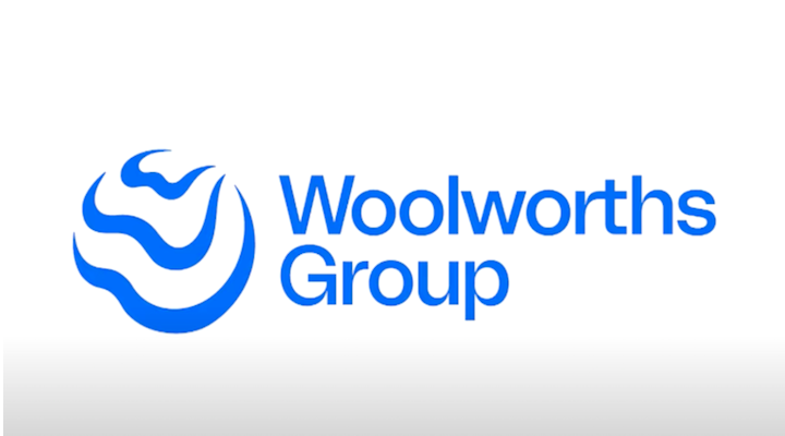
Woolworths Group has unveiled a new corporate identity to “better symbolise its evolution and what its collective businesses and platforms stand for”.
The new brand identity will replace the group’s signature logo, which illustrates its name together with its five brands presented in five different colours. Meanwhile, the traditional Woolworths supermarket business logo will stay the same.
Designed in collaboration with Re, part of the M&C Saatchi Group, the new corporate logo features ‘W’ letters in a wavy form and follows a blue colour scheme.
“In designing the new symbol, it was important we represented what we stand for as a group today and how we will continue to act in the future,” said Andrew Hicks, chief marketing officer at Woolworths.
“Our commitment to our purpose was key to the design architecture.”
According to Hicks, the multiple ‘W’ letters stand for ‘We’, representing how the group create a positive impact, while the fluid shapes illustrate “the spirit of agility and adaptability”. The blue design resembles the waves and ripples, “converging on a common point on the horizon as a reminder of our shared commitment as a group to a better tomorrow”.
“It is the power of ‘We’ in terms of creating better experiences together for a better tomorrow that is represented in our new Group brand identity,” said Brad Banducci, CEO of Woolworths Group.
“It’s a symbol of the positive impact that we aspire to have and the purpose that unites us.”


