While here on vacation in the US, I just couldn’t help but stick my nose into a number of stores in San Francisco. We’re staying within stone’s throw of Union Square, where some of the world’s biggest retailers reside. The experience was mostly ups, but also a few downs. Big thumbs up: Walgreens, Powell St This rather impressive Walgreens uses the new inner city format that Walgreens launched 18 months ago in Chicago and New York. It must have been new, because the store was crawl
ing with management, as well as security personnel.
Walgreens is traditionally a drugstore in the American sense, meaning it sells pharmacy and supermarket items without food.
The Powell St store’s ground floor focuses on single serve and prepackaged food items for commuters on their way home, or office workers looking for something nice for lunch at their desk.
The Upmarket signed island bar features a chef preparing dishes, and is surrounded by cheeses, yogurts, soups, sandwiches, and interesting prepacked salads, such as couscous.
I was interested to see a self serve frozen yogurt bar with flavours with dispenser toppings.
The store also contains a few surprises, such as the aisle-end Coconut Water fridge and three doors of craft beer versus only two doors for mainstream beers.
This theme is continued in other categories, with specialty as well as single pack potato chips.
This store has lovely flooring, lighting, and a very warm feel, and heaps of checkouts for a small footprint store – nine in total.
The single horizontal queue for the checkouts was merchandised with impulse items, almost like an adult version of what you would see at Big W or Target.
This is what an upscale Coles or Woolworths express format in a Australian CBD location could look like… if they got serious about it.
Medium thumbs up: Uniqlo, Powell St
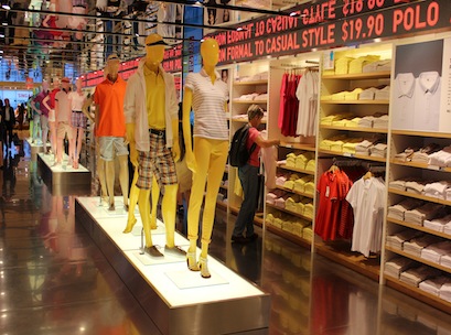
The three-storey Uniqlo store next door to Walgreens was humming. Here is a store that shows the power of great merchandising, and it’s done simply using colours.
When I visited it was all about down puffer jackets for $90, as it’s currently winter.
Nearly 50 per cent of the ground floor is given over to bays of the parkas, with each bay in a different colour.
Simple rotating colour coordinated mannequins are dressed in all red near the reds, or blue near the blues, adding movement.
To prove the point, the store was full of people and there are virtually nothing on special and no Christmas decorations.
Thumbs down: Macy’s, Union Square
I’m not surprised that Macy’s is financially in trouble.
This store – the Macy’s flagship in San Fransisco – certainly looked like it has skimped on the Christmas spirit.
Despite Christmas wreaths in every street-facing window and the Salvation Army choir out the front, the store interior has virtually no Christmas decorations, save for the odd bauble here and there.
Its sole nod to Christmas is the occasional off-location display table with ‘Christmas savings’ point of sale displayed on a few items.
Otherwise the store is merchandised like any other time of year and, while it was immaculately tidy, simplicity doesn’t make for inspiration.
The Macy’s website is more interesting, offering holiday gift guides and online exclusive specials.
They’ve got it the wrong way around – the physical store should be the inspiration and the online store for easy transactions.
Given their Christmas message on the storefront is “believe”, I’m not sure what we are meant to be believing in, when it evidently doesn’t believe in itself.
What are the lessons?
Know your location and the needs of the shoppers in it, and tailor your offer to suit.
Don’t underestimate the use of colour in merchandising.
Decide whether your merchandising and offers are going to be in the Christmas spirit or not.. but you can’t be half pregnant.
Norrell Goldring is head of shopper insight and retail strategy at GfK, and has worked in category and channel planning for Coca-Cola, Goodman Fielder, and Vodafone. Contact her on 0437 335 686 or norrelle.goldring@gfk.com.

