From working with influencers to going viral, social media has significantly changed the way retailers and brands market their products to consumers over the past decade. One of the more interesting changes is the distinct visual style that has developed on Instagram in particular. Every second brand on the platform seems to sport an all caps or all lowercase logo in a white sans serif font and pared down packaging in a single full-bleed colour. This look is particularly prevalent among di
digitally savvy, direct-to-consumer brands targeting Gen Z and millennial customers, and brands in the beauty sector, but aspects of the “Instagram aesthetic” have cropped up in many different places.
Last year, for instance, Burberry changed its iconic logo to a modern sans serif font, and recently, Ikea switched its blue and yellow logo to an all-white version to make it easier to overlay on digital images and videos.
While there are some practical reasons behind the rise of the Instagram aesthetic – sans serif fonts are considered to be easier to read online and the simplified styling arguably conveys a sense of “authenticity” – there are other reasons why brands say the trend works for them.
We spoke to three businesses that have embraced the Instagram aesthetic about their design choices.
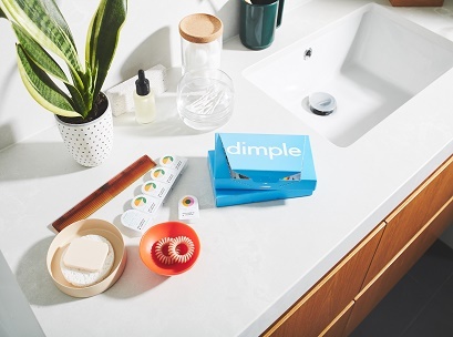
Dimple: The ‘shelfie’ shot
Dimple is a new subscription contact lens brand targeting the millennial market. It aims to provide a more “relevant” offer to customers not only through price and convenience, but also branding.
“We aren’t another online retailer selling all the big-name brands; we’re a single, youth-focused brand selling a lifestyle as much as we are contact lenses,” Dimple founder Shaun Polovin tells Inside Retail Weekly.
Dimple ships its contacts in a bright blue box (featuring an all lowercase logo in a white, sans serif font) that was designed to be displayed on a bathroom shelf or bench like any status beauty product.
“We were very cognisant of designing something that would happily sit in a ‘shelfie’ shot,” explains Dari Israelstam, founder and creative director at Universal Favourite, the branding agency that worked with Dimple on the design.
“The atmosphere and feel we wanted to have was bright, positive, fun. The colours [on the packaging] reflect that…but I suppose there’s also a sensibility of contemporary design that speaks to the kind of consumer Dimple is targeting.”
However, Israelstam adds that brands can’t just focus on getting the look of the product right. If their logo and packaging are meant to convey simplicity and authenticity, they need to back that up with their actions too.
“The millennial consumer is super-savvy and they’ll see through any brand that’s just trying to be right for them without actually following through,” he says.
“You can dress something up however you like but if it doesn’t match up with the ethos of the brand, it’s not going to hold up, and will fall flat at some point.”
HiSmile: Sleek and simple
Since launching in 2014, oral hygiene brand HiSmile has catapulted to a nearly $100 million business primarily through its use of social media advertising and influencers like Kylie Jenner.
In both paid posts and user-generated content, HiSmile’s teeth-whitening products, packaging and logo feature prominently. The company recently updated its logo design – the name of the company over a graphic of pink lips – to make it more versatile and easier to read online.
“We separated our two strongest elements, that being the lips and the HiSmile text, knowing it would make both components stronger as standalone elements,” says Bronte Jones, head of social media at HiSmile.
“Our packaging and products have always had the same concept – being sleek and simple in design and something that is appealing to photograph.”
Indeed, much of the Instagram aesthetic – sans serif fonts, limited colour palettes, minimalistic design – is about enticing people to post photos of the product, and making it easy for others to identify the brand and product in the photo.
But that may be beginning to change, according to Jones.
“Previously Instagram was a place purely for clean, aesthetically appealing images, but due to the saturation in content being posted on Instagram, brands are now looking for more ways to grab audience attention,” she says.
Sand & Sky: An emotional connection
Sand & Sky is the latest brand to emerge from health and beauty brand incubator Supernova, which was founded by sisters Sarah and Emily Hamilton of SkinnyMint and Bella Box fame.
The pink clay mask brand ticks many of the design boxes associated with the Instagram aesthetic – white, all-caps logo in a sans serif font, single colour packaging, but the co-founders say their choices weren’t informed by the trend per se.
“Sand & Sky is a face mask made from Australian pink clay, so of course our packaging is naturally pink. We wanted to bring Australia to the rest of the world through our product, and when people think of Australia, they think of our beaches – the sand and the sky. Our logo’s font and formatting is simple, just like our product and its packaging,” explain Sarah and Emily Hamilton.
“We didn’t follow specific rules or guidelines on font and colour when creating branded content. We believe in emotional connection with our audience and content that will create brand love on social media. This is how we designed our brand.”
The co-founders point out that there is no “magical” font or colour that guarantees success online. While much has been made of “millennial pink”, lots of popular brands utilise blue or yellow.
“Each brand needs to find their own way to express themselves, in a way that will resonate to their audience, and create strong brand love.”