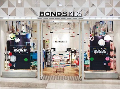
Bonds may be retail’s new kid on the block, but the iconic Aussie brand is shaking up the sector as it prepares to take on a new market – childrenswear. Bonds’ latest concept store, Bonds Kids, opened last year at Melbourne’s Westfield Doncaster, and is part of the Pacific Brands-owned company’s aggressive push from wholesale to bricks and mortar retail. Since opening its first Bonds adult store in May 2012, also at Westfield Doncaster, Bonds has grown its network to 17 stor
es nationwide. Now, the national icon has set its sights on Australia’s tots.
Aimed at kids aged between three and seven years old, Bonds Kids is the brand’s first foray into the childrenswear category, with it previously only creating babywear for newborns for both its wholesale and retail divisions.
While Bonds Kids draws on some of the strongest elements of Bonds’ original bricks and mortar blueprint, unlike its parent store, it aims to tug at the heartstrings of customers with ts use of colour and playful design. Although the store is said to be a whimsical take on the Bonds’ original store aesthetic, some of the brand’s trademark features are hard to miss, including the significant use of light, a white-based colour palette, bold branding, and creative visual merchandising.
A major point of difference, however, is its greater splash of colour, creative use of varying textiles, and eye catching patterns throughout the store.
“Bonds wanted something to show the heart and soul of the brand, a space that is playful and that maintains the visual link to the Bonds store design,” Kristina Hetherington, MD of Design Clarity, told Inside Retail Magazine.
Bonds Kids uses a variety of textiles, artwork, and furniture to emphasize its ‘yarn’ theme, whereas, the make up of Bonds’ adult stores generally consists of a more simple and clean design, with minimal use colour.
“The concept draws on the diverse and flexible nature of yarn, creating an environment that encourages creativity, fun, and interactivity with an emphasis upon pattern, shape, and tactility,” Hetherington explains.
“Yarn also has a double meaning as it’s a play on words – having a yarn as Bonds is a really iconic Australian brand.”
A major highlight of the store is the Kids Cafe. Situated in the centre of the store, the Kids Cafe is a designated play area for children. Framed by a vibrantly coloured mat, the area features tables, Acapulco chairs, and colouring pads.
Hetherington says the Kids Cafe is an integral part of the design, with Bonds wanting kids to feel at home and to encourage creativity instore.
Located directly above the Kids Cafe is a large suspended bulkhead feature made from coloured yarn weaved in and out of a timber frame. Suspended globes on colourful cables and knitted pendants also hang from the ceiling, adding a quirky dynamic to the store.
In line with its traditional store footprint, the Bonds logo is a major focal point of the store that is located on the back wall behind the front counter. Alongside the logo is weaved yarn, continuing the theme.
Despite its colourful design, Bonds product remains the hero of the store, a signature trademark of Bonds’ retail stores.
A colourful tile display is used to emphasise its underwear range, a core product line for Bonds Kids, around the store.
Same but different
While there are several trademark features of the original store design, also created by Design Clarity, there are also some significant contrasts.
Key differences include the colour of the store logo – Bonds’ traditional black and white logo has been reversed in its Kids store. The size of its store is also a change – where Bonds adult stores range from around 140sqm to 200sqm, Bonds Kids uses a smaller footprint at Design Clarity was faced with the challenge of space in the creative process, as well as making sure that customers and staff are able to differentiate core lines within the store.
To ensure this, the design firm used a mix of timber and metal joinery, as well as variety of textures in the backdrops to indicate different areas.
Its white colour base, bright lighting, and the store’s mixture of lightly coloured tables and cabinets to display stock, enable the brand’s entire range to be displayed without feeling overloaded.
Design Clarity also created allocated pram parking bays to further give the feeling of space within the store.
This year, Bonds will continue its retail rollout. A second Bonds Kids store is expected to open at Highpoint Shopping Centre in Melbourne in March, followed by Kids’ first strip location, scheduled to open at Brighton, also in Melbourne in April.
This article first appeared in Inside Retail Magazine’s February/March 2014 edition.

