 By: John Tozzi, head of digital delivery at J. Walter Thompson Sydney.
“Hi, I’m John, 27 and I have three seconds to spare. Oops sorry that page took too long to load – back to google. Also (just FYI) I’m not prepared to click “next product page” especially since there’s 17 more pages. Sorry, g2g byeeeeeee.”
So, it is holiday shopping season and you’ve decided your busy life hasn’t afforded you enough time to cram it all into Thursday night shopping. Plus, you just bought your first pair of wireless headphones back in June so you are “super techy” and decide to do all your shopping online.
Here’s how your online shopping experience probably went in seven steps:
- Click first website you recognise
- Go to search bar
- Page loading…
- Page loading…
- Back button to www.google.com
- Repeat until the internet meets your expectations.
It’s a weird thing our expectation with machines. On one hand, they can do so many tasks much quicker than we can but on the other hand, we humans get really frustrated when they don’t “read our minds” and act intuitively.
This article isn’t about internet speeds, or search returns or even Amazon drone delivery. It’s about design, UX design and how brands sometimes leave this rock unturned in their search for sales increases, seasonal shopping trends and the overall customer experience online.
Take a look at the example below:
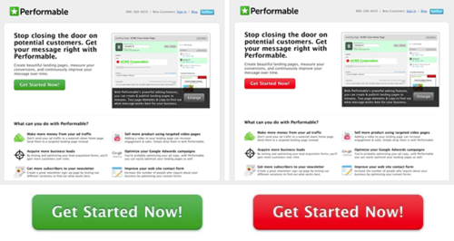
Here is a simple UX experiment. There are two identical screens selling two identical services and products to a customer. One service obviously has a green themed call to action (CTA) and one is red.
Green is a stereotypical “go ahead” colour we typically associate with traffic lights, or a moving forward action. We can also see that it fits nicely into the Performable style guide so a safe contender.
Red on the other hand is typically associated with warning, stopping or even blood. We see red sometimes categorised as bad, evil or a reason to stop what we are doing and pay attention.
This button test was conducted with over 2,000 page views to record results of the two different CTA’s. Here is why the red button outperformed the green one by 21 per cent.
When we land on this page our eyes are immediately drawn to the red as a cue of danger, it’s a primitive instinct to look for danger and address it. The green on the other hand is no cause for alarm, we see it but it doesn’t heighten our senses. We are captivated or intuitively drawn in by the red and therefore retain the information of the CTA much deeper – on two areas in this example.
Consider the fact that this 21 per cent increase in page activity can be traced back to a 21 per cent increase in other metrics (sales, leads, other consumable product information). More importantly we didn’t have to increase traffic to the page we just needed to increase the efficiency of the page.
Brands sometimes overlook how important it is in this new digital era to pour vitamins on their online/digital customer experience. It is no longer 20 per cent of your overall revenue. It’s no longer a place to showcase products you sold 6 months ago. It is a living, breathing vehicle to connect you to your purchasing (or potentially purchasing) power.
For example, if you were Woolworths, you wouldn’t leave the endcaps the same all year, would you? You would try different set ups, different displays, different products until it made you business the most amount of money. There is no end game – just optimise forever.
There are new and surfacing trends in the online shopping and browsing experience, including:
- More mobile responsive design: Mobile designs need to come first as they will always contribute to the most traffic, with design for more breakpoints (devices) than Desktop, Tablet, Mobile.
- Evolution of semi-flat design: Flat designs were a bit complicated and created some issues, we now use semi flat designs as a sexier, easier to accommodate option.
- Images, lots of images: Customers want to see tons of images. If it’s clothing, customers want to see a 360 degree look, on and off the model, worn with other clothes. Customers even want to see how cool it’s going to look wrapped around their waist.
- Material Design to evolve further: Popularised by Google and Pinterest, material designs include: card-like layouts, responsive animations, transitions, and simplicity.
- Long scrolls with lazy loading: If we like bottomless brunch we are going to love bottomless scrolls. No more “next page”, just keep products coming. Next page = new page to load = annoyed millennial.
- Rich animations and cinemagraphs: When customers land on a retailer’s page, let their eyes be drawn to something, catch their attention and keep them in your “purchase flow”. We typically see these in page headers as “heros” inclusive of motion graphic demos, 360 videos of products, background images, homepage banners and product images.
- Hamburgers on the left: Bootstrap development framework always tells us to keep the hamburger on the right. Google begs to differ as they want it to be the first thing the user sees so they can find what they are looking for. I’m with google on this one.
- Hand drawn elements: We’re hipsters, give us cool hand drawn artwork.
- LARGE TYPE FONT: See, told you it works.
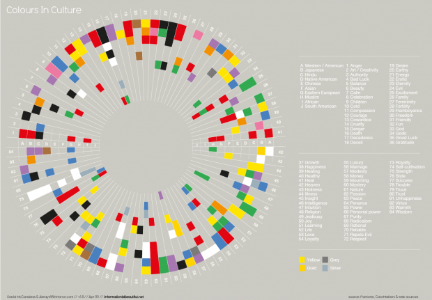
- Using more bright colours: Get to know your colours: This chart below represents the meaning of colour in cultures.
It should be a top priority for brands to optimise their existing pages, find new ways to layout product information online, speed up search queries, test CTA’s, test templates, test the site architecture, switch navigation designs, look at heat maps, do a features and functionality study, run a task based usability test and much more. These tests can provide priceless information to a business that other buying behavior studies cannot. We can learn about abandonment rates in checkout carts, how users read information and even monitor eye tracking for content.
Whether you are working for an agency running a brand team or client side, there are some really simple ways to get this conversation started amongst your work. Reach out to your digital team and ask them to start pulling data from your analytical platform to track the performance of the site. If you already have these tools in place start looking at what the data means. Where do we need to improve our flow? Do we have a bottle neck on the site? Do we have a high abandonment rate on a certain page?
There is a direct correlation between optimising crucial parts of a webpage and the ROI to the business. It is an ongoing process that needs detail an attention. Start with the small stuff and you will find quick wins.