 Navigating product selection instore can be overwhelming, and retailers are developing solutions that offer a helping hand.
By merchandising products based on customers’ needs, they can aid discovery and simplify purchase decisions.
Here’s six global and Australian names that are pushing the limits of instore product navigation right now.
Australia: Aldi Lunchbox
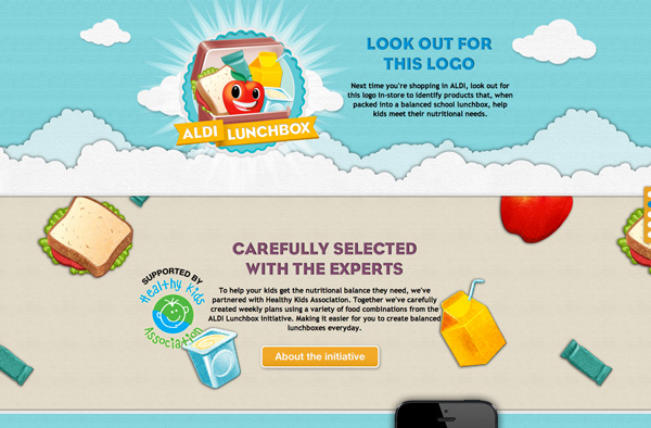
Supermarket chain Aldi has launched the Aldi Lunchbox initiative in the Australian market, which links a meal planning app with instore signage to help parents plan nutritious and filling meals for children.
The free iPhone app and website gives parents access to lunchbox ideas, nutritional information, and help with planning shopping lists.
Parents can create profiles for up to four children, including their dietary requirements, favourite snacks and food dislikes.
The platform generates a week’s worth of lunchbox ideas, ensuring the child receives a balanced diet of grains, fresh fruit, vegetables and protein.
Once the parent is happy with the plan, they can generate a shopping list, which can be viewed on the website, app, or emailed.
Finding products instore is made easy as stickers with the Aldi Lunchbox logo are shown on product shelves next to items included in the initiative.
The UK: Harvey Nichols’ BeautyMart
BeautyMart brings magazine-style editorial into a multi-brand retail space.
Launching in London on Harvey Nichols’ third floor, adjacent to fashion rather than cosmetics, the boutique-style space encourages customers to browse and consult Beauty Stylists.
It also lets shoppers use iPads to search product reviews and post comments on the BeautyMart website.
It’s offering of cult, classic, and lesser-known brands has been curated by its founders – former Vogue beauty editor, Anna-Marie Solowij and Millie Kendall of Ruby & Millie makeup.
As well as the shopfloor space, branded vending machines stocking an edit of products will be situated in nightclubs, hotels, train stations, airports or restaurants.
The first BeautymMart is in Harvey Nichols’ fifth floor food hall and restaurant space, which places beauty retail in a social environment with the convenience of extended opening hours.
An e-commerce platform is scheduled for 2013.
Global: The Body Shop Pulse boutiques
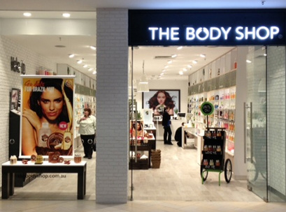
The Body Shop’s Pulse Boutiques have a market feel to highlight the brand’s values.
They feature wooden carts and steel buckets to display products, and blackboards with handwritten chalk messages for signage.
As well as inviting customers to test products, story selling tables present a regularly updated product display of the top 10 customer favourites, with note cards displaying positive reviews and star ratings, and a map detailing where the item comes from.
The store also has a world map pinpointing where the Body Shop has Fairtrade partnerships and a bulletin board for local volunteering events.
The Netherlands: Bilder & de Clercq
As profiled previously by Inside Shopper, Bilder & de Clercq is a new independently owned grocery store in Amsterdam that aims to make meal planning easier.
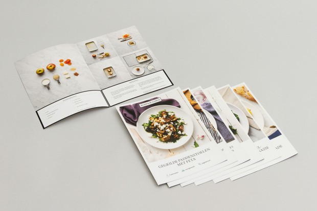
Instead of arranging products in traditional aisles, they are displayed in recipe ideas in the 220sqm space. Shoppers select from 14 dishes, divided over seven presentation tables.
At the centre of each table, a large visual recipe card highlights the meal suggestion; all the ingredients needed to make it are displayed below, with clear instructions on how much of each to buy.
This speeds up and simplifies the customer’s decision, and minimises waste as just the right amount of each ingredient is bought.
A complementary wine for the meal is found next to the ingredients.
The customer can also pick up a recipe card with step-by-step visual instructions of how to make the dish at home.
South Korea: Woman’s Wardrobe Daily Store
The Woman’s Wardrobe Daily fashion store in Seoul arranges selected clothing and accessories as complete looks, merchandised within wardrobe-style displays.
This suggests to the shopper how Woman’s Wardrobe Daily’s clothes might be worn and how they could look hanging in their closet.
The rest of the store has been designed to feel like a giant aquarium: a reference to the brand’s fish shaped logo.
The bright white walls have pools of blue lighting, while panels cut like waves flow down the length of the store.
The UK: Morrisons’ Store of the Future
British supermarket chain Morrisons’ new Store of the Future merchandises its wine range according to price, rather than region (‘Under £5’, ‘Between £5 and £8’ and ‘Over £8’).
Elsewhere in the store, the fresh fruit and vegetables area is inspired by a traditional farmers’ market, with low level open top containers and handwritten chalk labels.
Ice beds and misting technologies optimise the shelf life of products.
The store brings together innovations that have been trialled in Morrisons’ test stores over the past year, including the ‘Fresh Lab’ innovation store in Kirkstall near Leeds and the brand’s ‘M local’ stores.
This story was originally produced by GDR Creative Intelligence for POPAI UK & Ireland. To read the full story, please visit POPAI.

